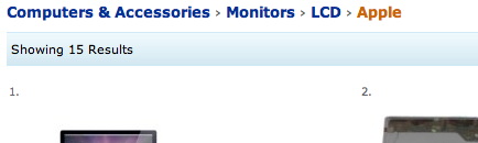
While working on a project with Richard Amos about a year ago we were pondering the static linear nature of breadcrumbs and wondering why they should always be so. The breadcrumb serves two purposes; firstly it gives users a sense of where they are in a site’s structure, helping them to never feel lost or disoriented. Which leads to the second purpose, to always provide them with a path home. The first of these is done entirely visually, you don’t need to click on the breadcrumb or interact with it in any way in order to help orient yourself. Its second function though, is all about the interaction, and this is where I feel it falls somewhat short. A typical scenario for using the breadcrumb might go something along these lines: Bernard is shopping on Amazon for some bits for a computer he’s just bought. He’s googled for Apple monitors and been brought straight into Amazon on their page of Apple monitors. After choosing one and adding it to his cart, he decides he needs some extra RAM. Bernard looks to the Amazon breadcrumb and sees something along the lines of:

It would seem like a fair assumption that he should step back up to Computer Accessories and check in there for the RAM, but unfortunately this isn’t the case. RAM is actually under Computer Components which resides at the same level as Computer Accessories, but there’s no way for Bernard to know that this section even exists. In reality, the Amazon breadcrumb is even less useful than the one I have presented here as it hides the first level of the hierarchy for some reason.
With Scotch Egg Navigation, we allow the user to see all the options available at each level of the hierarchy. So Bernard can have a quick check to see if RAM is listed in the Computer Accessories section of the site…
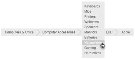
And when he finds that it isn’t, he can check for other suitable categories at the next level up, where he would find Computer Components, the correct category for RAM.
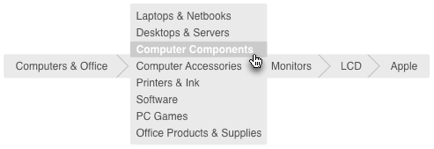
One click and he’s in the right place.
The two separate purposes of the breadcrumb have both been improved:
Firstly, our visual representation of current position is still immediately viewable helping the user understand their current position in the structure of the site, but we’ve also given them the ability to view much more of the site’s hierarchy. And secondly, we’ve given them the ability to traverse that hierarchy without backing out and in again.
It’s the difference between giving someone directions to the postoffice and giving them a map with the postoffice and all other points of interest marked on it.
Scotch Egg Navigation, it’s breadcrumbs with hidden meat.