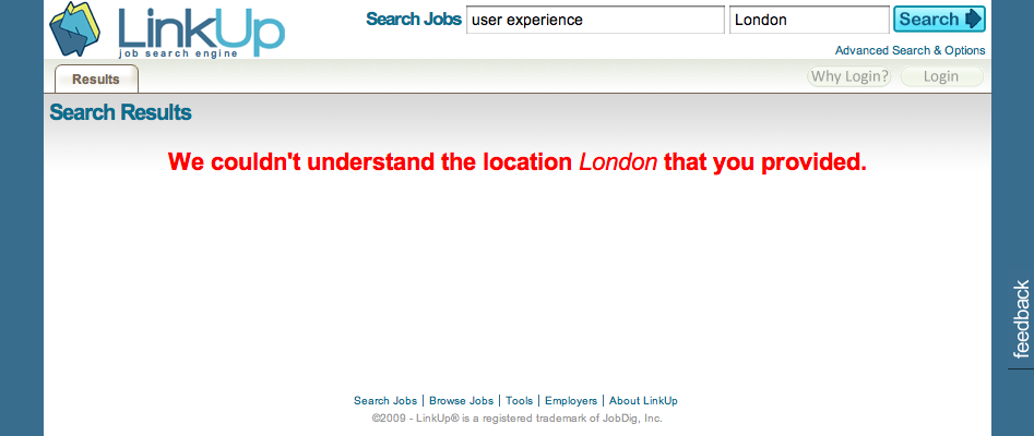
Testing out Linkup.com’s new service I got a slightly unexpected error message; “We couldn’t understand the location london that you provided.”

While I don’t mind that it didn’t understand the word London, it is a shame that it doesn’t offer the user any options that may make their search work. Here it should be trying to help the user, rather than simply telling them that it doesn’t understand.
- “Did you mean…” followed by a list of linked words similar to the search term helps to catch misspellings.
- If the search term is too broad then narrow it, “Do you want London Ontario or London UK?”
- If the service is not available in that area then let the user know.
- Provide examples of search terms that do work.
I have no idea why my search failed in this case, “London, UK” doesn’t work either. In the end I’ve come away from this site not knowing why my search didn’t work and for all I know the service is just broken. One of the golden rules of user experience should be to always help the user recover from an error.